

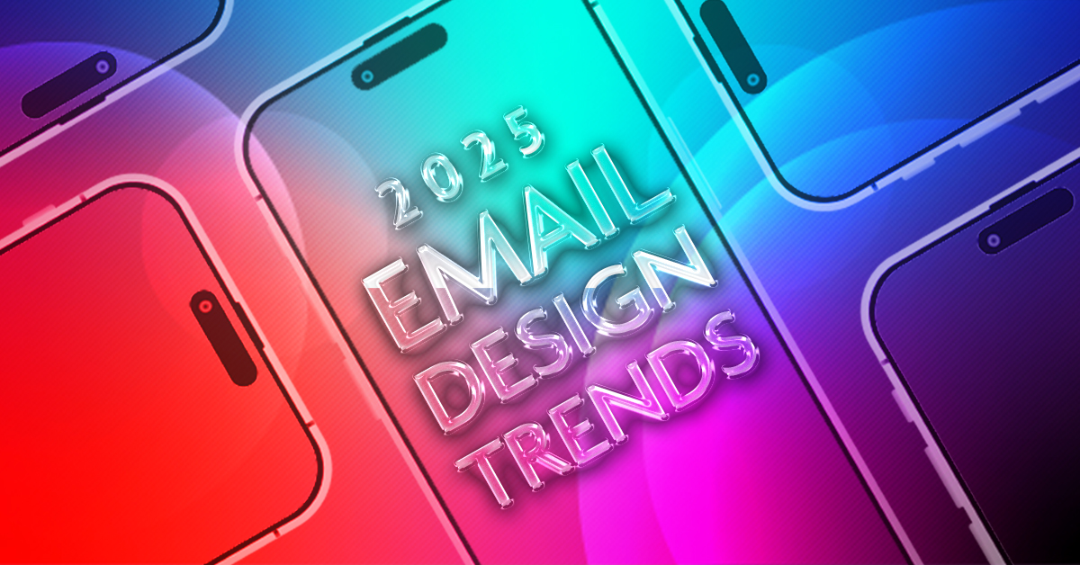
Top email design trends of 2025
In the ever-changing landscape of digital marketing, email continues to prove its staying power. Despite new platforms and shifting audience behaviors, email remains one of the most reliable and measurable engagement channels. At Lunne, we design, write, and code thousands of emails every year for clients in the health and finance industries. Because of this volume, we have a unique perspective on what’s working and where the industry is heading. We don’t just follow trends—we analyze them, experiment with them, and adapt them in ways that best serve our clients’ goals.
We sat down with Josey Allen, email design specialist, to dig into the top design trends shaping inboxes in 2025. Josey offered her take on how these styles can enhance engagement, where they’re best applied, and why brands should pay attention.
1. Glassmorphism + frosted layers
Glassmorphism—the use of translucent, frosted-glass effects—has migrated from app and interface design into email. This approach creates a layered, ethereal effect that can help products stand out while keeping backgrounds visually interesting.
Josey: “Glassmorphism works especially well in consumer-facing emails, like beauty and lifestyle brands. It gives a polished, almost futuristic feel, but the key is using it sparingly so the content doesn’t get lost. It’s best for spotlighting a product or message where you want the visuals to do the heavy lifting.”
For brands in health or finance, subtle applications of this style can still elevate design, particularly in promotional emails where a product or service needs to shine without overwhelming the recipient.
2. 3D floating elements
Three-dimensional floating visuals are everywhere in digital design right now, and email is catching up quickly. These elements create depth and dimensionality, making products or featured images appear as though they’re hovering within the inbox.
Josey: “Floating elements keep people engaged with what’s at the center of the message. Even if the email itself is flat, 3D visuals create interest and help focus attention right where you want it. We’ve seen this do really well in product launches, especially when the design echoes what’s happening in fashion or interior design.”
The strategy behind 3D elements is clear: they help establish hierarchy and guide the eye. When done right, this trend can boost click-through rates by making CTAs (calls to action) and featured products feel more tactile and real.
3. Liquid metal + chrome aesthetics
The glossy sheen of metallic design—chrome, liquid metal, and reflective surfaces—is making a splash in 2025. This look brings a futuristic, high-tech energy to email campaigns and signals boldness and innovation.
Josey: “Chrome and liquid metal are definitely a statement. They’re not for every brand, but when you want to feel cutting-edge, they can deliver that ‘wow’ factor. We’re seeing this resonate with industries that want to feel premium or tech-forward, and it pairs nicely with strong, minimalist layouts.”
This trend also serves as a reminder that email design is more than just functional—it’s emotional. Used strategically, liquid metal and chrome can communicate luxury and confidence, making them a natural fit for fintech, credit, and premium service offerings.
4. Comfort-driven design
Not all trends lean into boldness. Comfort-driven design is all about dialing back the intensity, with soft colors, approachable textures, and layouts that feel easy to engage with. It’s a direct response to the information overload many consumers feel today.
Josey: “Comfort-driven design is all about making the experience feel inviting instead of overwhelming. It’s almost like saying, ‘take a breath, this message isn’t here to push you—it’s here to help you.’ In healthcare, especially, that softer approach goes a long way toward building trust.”
By leaning into comfort, brands can foster an environment of trust and calm. This is especially effective in industries where sensitivity and reassurance matter, like financial wellness or patient communications.
What these trends mean for marketers
Each of these trends reflects deeper cultural shifts: a desire for clarity, a hunger for novelty, and an appreciation for experiences that feel personal and human. For marketers, the takeaway isn’t to use every new look just because it’s popular, but to understand what each style communicates and how it fits the brand’s strategy.
At Lunne, we treat design trends as tools, not rules. A frosted background might highlight a new healthcare offering, while a 3D product render could add excitement to a credit card promotion. What matters most is intention: aligning design with message, subject line, and audience expectations.
Looking ahead
While these four trends are making waves in 2025, they’re just the beginning. Our team is also reporting on shifts like leading with dark mode, ADA compliance in email design, and the rise of personalized elements that make emails feel more human. These areas are especially critical for the industries we serve, where accessibility, compliance, and clarity can make or break engagement.
We’ll explore these emerging trends in upcoming blog posts. In the meantime, brands should see email as more than a channel—it’s a branded experience in itself. When design, copy, and strategy come together seamlessly, email becomes not just a message in someone’s inbox, but a meaningful moment of connection.
At Lunne, our role is to make sure those moments are both beautiful and effective. By staying ahead of trends and grounding them in strategy, we help our clients strengthen their brand presence and drive measurable results.
Are your emails on trend? Reach out to our experts at Lunne to find out how we can elevate your email strategy.